- Course Details
- Course Outline
- Training Deliverables
Course Description
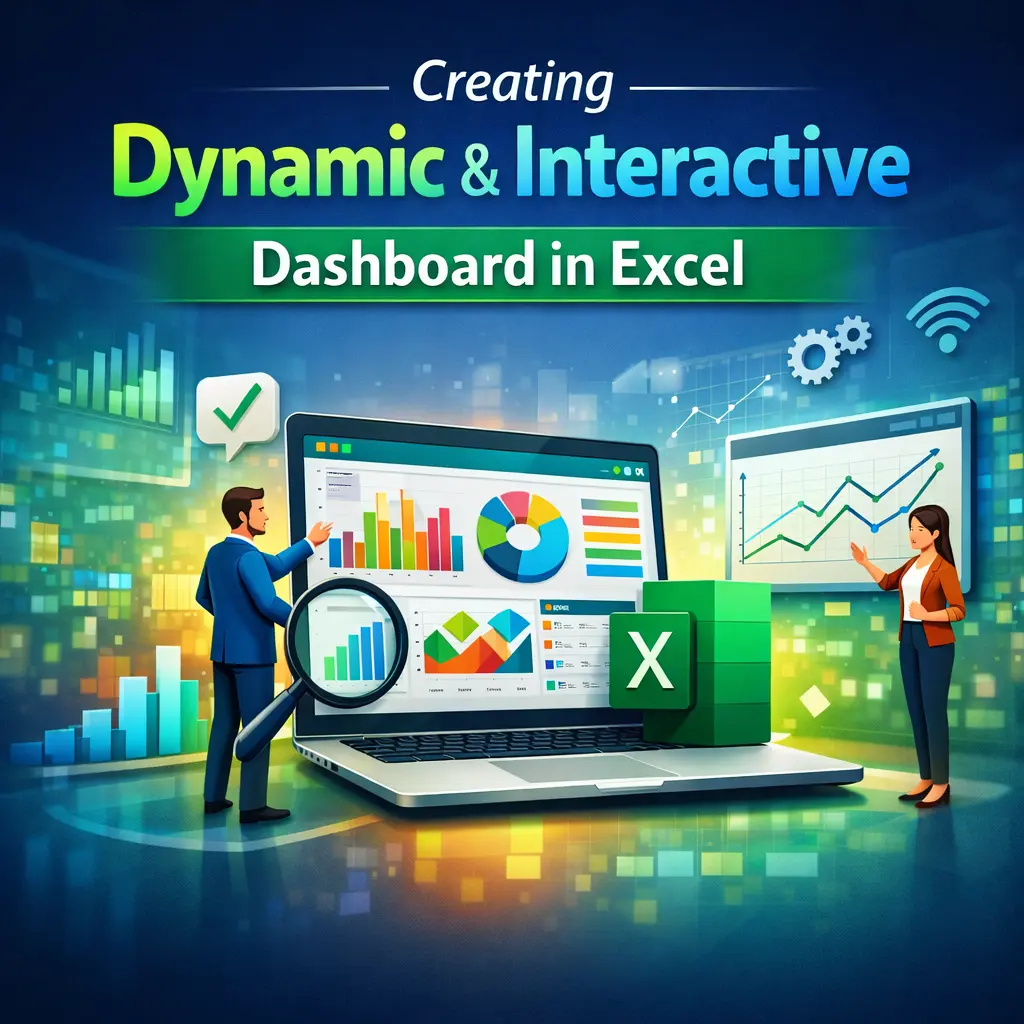
This hands-on training is designed to help professionals build dynamic, interactive, and visually appealing dashboards using Microsoft Excel. Participants will learn how to transform raw data into meaningful business insights by using Excel Tables, Pivot Tables, Pivot Charts, advanced formulas, slicers, timelines, and interactive controls.
The course focuses on dashboard design best practices, KPI reporting, and automation techniques, enabling participants to create executive-level dashboards for Finance, HR, Sales, Operations, and Management reporting.
Learning Objectives
By the end of this course, participants will be able to:
- Plan and design professional Excel dashboards.
- Organize and prepare data for reporting.
- Create dynamic charts and Pivot Charts.
- Build interactive dashboards using Slicers and Timelines.
- Apply advanced formulas to automate calculations.
- Design KPI cards and executive summary reports.
- Create dynamic charts using Named Ranges.
- Build dashboards that automatically update with new data.
- Apply dashboard design best practices.
- Develop business dashboards for different departments.
Who Should Attend?
This course is ideal for:
- Business Analysts
- Data Analysts
- MIS Executives
- Finance & Accounting Professionals
- HR Professionals
- Sales & Marketing Teams
- Operations & Supply Chain Professionals
- Managers & Team Leaders
- Anyone responsible for creating reports, dashboards, or business presentations in Excel
Day 1 – Dashboard Foundations & Data Analysis
Module 1: Dashboard Planning & Design
- What Makes a Good Dashboard?
- Understanding Business Requirements
- Identifying KPIs & Metrics
- Dashboard Layout Planning
- Dashboard Design Best Practices
- Choosing the Right Charts
Module 2: Preparing Data
- Structuring Source Data
- Excel Tables
- Named Ranges
- Data Validation
- Sorting & Filtering
- Data Cleaning Techniques
Module 3: Advanced Excel Formulas
- XLOOKUP
- INDEX & MATCH
- SUMIFS
- COUNTIFS
- AVERAGEIFS
- IF & IFS
- TEXT Functions
- Date Functions
- Dynamic Array Functions (FILTER, SORT, UNIQUE)
Module 4: Pivot Tables & Pivot Charts
- Creating Pivot Tables
- Grouping Data
- Calculated Fields
- Pivot Charts
- Refreshing Reports
- Best Practices
Module 5: Interactive Dashboard Components
- KPI Cards
- Slicers
- Timelines
- Interactive Filters
- Dynamic Titles
- Conditional Formatting
- Sparklines
Day 2 – Dynamic Dashboards & Real-World Projects
Module 6: Dynamic Charts & Visualizations
- Dynamic Charts
- Combo Charts
- Waterfall Charts
- Doughnut Charts
- Funnel Charts
- Heat Maps
- Bullet Charts (Using Excel Techniques)
Module 7: Interactive Dashboard Features
- Drop-Down Selection
- Form Controls
- Option Buttons
- Check Boxes
- Scroll Bars
- Hyperlinks
- Navigation Buttons
Module 8: Dashboard Automation
- Dynamic Named Ranges
- Automatic Chart Updates
- Pivot Table Refresh
- Refreshing Power Query Data
- Protecting Dashboard Sheets
- Print & Export Options
Module 9: Dashboard Design Best Practices
- Executive Dashboard Design
- Color Selection
- Data Storytelling
- Layout & Alignment
- Performance Optimization
- Dashboard Documentation
Module 10: Real-World Dashboard Projects
- Sales Performance Dashboard
- HR Analytics Dashboard
- Finance Dashboard
- Procurement Dashboard
- Inventory Dashboard
- Customer Service Dashboard
- Executive KPI Dashboard
- Hands-on Dashboard Development Project
Training Deliverables
Participants will receive:
- Training Material / Course Manual
- Practice Files & Sample Datasets
- Excel Dashboard Templates
- KPI Dashboard Design Guide
- Dashboard Best Practices Checklist
- Dynamic Chart Examples
- Certificate of Completion
- Post-Training Support & Q&A